No items found.
Problem Hunting
Jul 11, 2025

Your app has approximately 300 seconds to prove it's not rubbish before users delete it faster than they'd swipe left on their ex. Welcome to the brutal mathematics of first impressions, where micro-moments make or break everything.
Let's start with a confession: most product journeys are about as inviting as a swimming pool filled with thumbtacks. Your users arrive all bright-eyed and bushy-tailed, having somehow survived your marketing funnel, only to be greeted by a labyrinth of confusing screens, meaningless tooltips, and the overwhelming sensation that they've made a terrible mistake. And then we wonder why our retention graphs look like they're falling off a cliff. Shocking, isn't it?
The first five minutes of user interaction is where dreams go to die. Having watched countless founders (myself included) obsess over feature development while treating onboarding as an afterthought, I can tell you with absolute certainty: your clever product means nothing if users don't stick around long enough to discover it.
The stats are grim. The average app loses 77% of its users within the first three days. Three days! Most aren't even making it past the first five minutes. We spend months building sophisticated features that precisely nobody will ever see because they've already uninstalled our app and are now mindlessly scrolling through TikTok videos of people failing at parkour.
Let's be honest – we've all been guilty of this. We convince ourselves that our product is so obviously brilliant that users will naturally push through any early friction just to experience our genius. (Spoiler alert: they won't.) We're like chefs who spend hours perfecting a soufflé but serve it in a dumpster. Presentation matters, darling.
After burning through embarrassing amounts of development time on features nobody used (because nobody stayed), I've become slightly obsessed with what I call "micro-retention" – the art of creating tiny moments of delight and value within the first 300 seconds that hook users like a perfectly cast fishing line.
Micro-retention isn't about grand gestures. It's about the small, carefully orchestrated touchpoints that collectively signal to your user's brain: "This is worth your time." It's the digital equivalent of walking into a shop and being offered a perfectly timed cup of tea – not immediately at the door when it feels awkward, but right when you're starting to feel comfortable enough to stay.
The framework breaks down into four critical moments:
You might be thinking, "Five minutes isn't enough time to demonstrate my product's true value!" And you're right – it isn't. But it's plenty of time for users to decide whether they're willing to invest more time to discover that value. The first five minutes aren't about showcasing everything; they're about creating enough intrigue and delivered value to earn the next five minutes.
Your app's first impression is like meeting someone at a party. Come on too strong ("WELCOME TO THE FUTURE OF PRODUCTIVITY!!!") and users will back away slowly. Ask for too much personal information upfront ("Before we show you anything, please fill out these 17 form fields and link your social accounts") and they'll question your intentions. Be too vague about what you actually do, and they'll wander off in search of clearer conversations.
The truth is, most onboarding experiences feel like they were designed by someone who's never actually met a human being. They're either clinically sterile or aggressively enthusiastic – neither of which inspires confidence.
Here are the non-negotiables for those crucial first 30 seconds:
Having learned from my own business mistakes (oh, the memories of forcing users through a byzantine registration process before showing them anything of value), I can tell you that delaying gratification is the fastest way to drive users away. The registration wall should come after they've seen enough value to justify the effort.
Between 90 seconds and 3 minutes, something magical needs to happen: your user needs to experience what I call the "mini aha" – a small but meaningful payoff that justifies their continued attention.
This isn't your product's full value proposition; it's the appetiser that makes them want to stay for the main course. Think of it as the digital equivalent of those free samples at Costco. Nobody's making a purchasing decision based solely on that tiny cube of cheese on a toothpick, but it creates just enough pleasure to keep you pushing your trolley down the aisle.
The most successful products I've analysed all create this moment within the first three minutes. Consider how some viral apps gain traction by delivering immediate value – one developer built a viral app in under 2 hours that increased website traffic by over 1000%. The success came from creating instant engagement and discovery of unexpected use cases by users:
After experiencing burnout from trying to do everything alone in my previous venture, I've become fascinated with how quickly these platforms make users feel competent. They don't overwhelm with options; they guide users to one meaningful accomplishment that creates momentum.
The final phase of micro-retention is getting users to make small investments that dramatically increase their likelihood of returning. Between minutes 3-5, your goal isn't to extract maximum value from users; it's to get them to put something of themselves into your product.
The psychological principle at work here is what behavioural economists call the "IKEA effect" – we value things more when we've put effort into creating them. It's why people become irrationally attached to furniture they've assembled themselves, despite the cursing and the inevitable extra screw that doesn't seem to belong anywhere.
This principle becomes even more critical when you understand that network effects are responsible for 70% of the value created by tech companies since 1994. Companies with strong network effects create defensibility by getting users invested early, as network effects are the strongest of the four remaining defensibilities in the digital age.
Effective investment hooks include:
Each of these actions increases what economists call "switching costs" – not in a manipulative way, but by creating genuine value that would be lost by leaving.
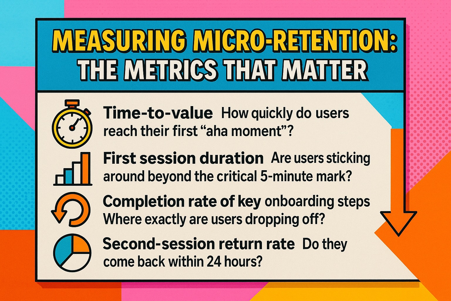
You can't improve what you don't measure, and micro-retention requires scrutinising metrics most founders ignore. Having learned from my own business mistakes of obsessing over vanity metrics while my actual retention was circling the drain, I now track these specific indicators:
The most revealing of these is often the "drop-off funnel" – seeing precisely where users abandon ship during onboarding. I've seen products where a single confusing screen was responsible for losing 40% of new users. Fix that one screen, and suddenly your entire acquisition economics transform.
Understanding the psychological drivers behind early abandonment has been my obsession since watching my previous venture hemorrhage users despite positive initial feedback. Users don't leave because they've made a careful assessment of your product's value proposition. They leave because of emotional reactions:
Confusion: "I don't understand what I'm supposed to do here."
Overwhelm: "This looks complicated and I don't have the mental energy right now."
Impatience: "I don't see immediate value, and there are 17 other apps competing for my attention."
Friction: "This is requiring more effort than I expected."
Disappointment: "This isn't what I thought it would be."
The flip side – what makes users stay – is equally psychological:
Create these feelings in the first five minutes, and you've laid the foundation for lasting retention.
The practical challenge with micro-retention is implementation. How do you actually create these magical first five minutes without derailing your entire product roadmap?
Start by being ruthlessly honest about your current onboarding experience. Have you actually watched real users interact with it? (Not your team, not your mum, not your supportive friends – actual, impartial humans who have no emotional investment in your success?)
The revelations from proper user testing are typically humbling and occasionally horrifying. That brilliantly intuitive interface you designed? Turns out it makes perfect sense only to people who already understand your product. That clever copy that had the team in stitches? Users are skipping right past it.
This challenge becomes even more critical when you consider that over 20% of small businesses fail within their first year, with nearly two-thirds not surviving a full decade. According to the Bureau of Labor Statistics, key failure reasons include insufficient capital, poor management skills, lack of a robust business plan, and weak marketing efforts – often stemming from overestimating revenue and failing to account for necessary operational expenses.
Here's how to implement micro-retention principles without throwing everything else off track:
The goal isn't perfection; it's incremental improvement. Each small enhancement to those first five minutes compounds over time, gradually transforming your retention curve from a cliff-edge to something resembling actual business sustainability.
Creating a frictionless first five minutes doesn't mean dumbing down your product. It means recognizing that complexity should be progressive, not front-loaded. The most sophisticated products in the world – from Photoshop to Bloomberg terminals – still need to deliver immediate value before revealing their depth.
Think of it like dating. You don't start by sharing your five-year plan and genetic health screening on the first date (at least, I hope you don't). You begin with a conversation that's engaging enough to warrant a second date. Your product's first five minutes should operate on the same principle – be interesting enough to earn more time.
Understanding this progression becomes crucial when you realize that success isn't guaranteed even with great onboarding. Consider how moving from problem discovery to sustainable revenue requires systematic execution across multiple phases, with onboarding being just one critical component of the broader validation and growth strategy.
Ultimately, micro-retention isn't just about keeping users; it's about respecting their time and attention. In a world where both are increasingly scarce, designing an experience that quickly delivers value isn't just good business – it's basic courtesy.
We've all experienced the frustration of downloading an app only to delete it minutes later. Don't let your product become another casualty of impatience. Those first five minutes aren't just the beginning of the user journey; for most products, they're the entire journey. Make them count.